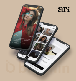
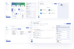
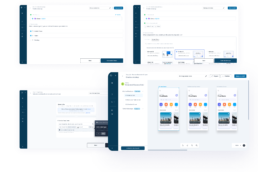
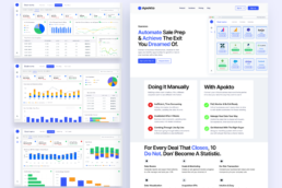
The goal of the product was to bring together various products from any brand’s website into a single, sharable and shoppable shop link that can be used on any platform.
Client
Ari
Services
Product Management
Low-Fi Mockups
User Interviews
High-Fi Mockups
High-Fi Prototypes
Year
2022
Deliverables
Mobile App Design
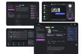
Web Platform Design
Admin Dashboard Design
DESIGN CHALLENGE
How can we streamline the mobile app and enhance its appearance for a better user experience?
THE SOLUTION
To streamline the mobile app and enhance its appearance for a better user experience, the following steps were taken:
- Simplifying the interface to reduce clutter and use clear, concise language to make navigation and interaction easy for users.
- Improving the visual design by using a consistent color palette, typography, and imagery to create a cohesive and aesthetically pleasing look.
- Making use of animation to provide feedback and enhance the overall user experience.
- Testing the app with real users to identify any usability issues and make necessary improvements.
- Focusing on accessibility to ensure the app is accessible for all users, including those with disabilities.
By taking these steps, the app was made more intuitive and visually appealing, resulting in a better user experience.
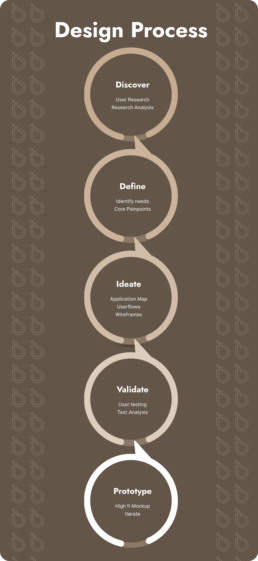
DESIGN PROCESS
Discover
Discovery included heavy user research to uncover shopping and sharing needs and market improvement opportunities through primary and secondary research.
Define
A concise UX strategy for shopping and sharing that defined user beliefs, attitudes, needs, pain points, and vision for product improvement.
Ideate
User flows and a Low Fidelity prototype was made to streamline various user journeys, with a focus on sharing and shopping brands.
Validate
The Low-fidelity prototype was tested for user feedback, improvements were made based on identified user error, frustration, pain points, and satisfaction.
Prototype
The Low-fidelity prototype was transformed into high-fidelity designs and a functional prototype for additional testing.
UX AUDIT
Mobile Application before Redesign
A thorough assessment of the mobile app’s user experience was conducted, with the objective of recognizing areas that needed improvement. The UX audit carried out comprised of examining different aspects of the product, such as ease of use, performance, accessibility, and appearance. Actionable recommendations aimed at enhancing the user experience and making the product more user-friendly were provided.
Some of the actionable recommendations were:
- Redesigning of the bottom navigation structure to make it easier for users to find what they are looking for.
- Streamlining the shopping process to reduce the number of steps and improve overall user experience.
- Adding an onboarding to make it easier for users to understand the app on initial landing.
- Enhancing the overall visual design by using a more consistent color palette, typography, and imagery
REIMAGINING
Low Fidelity Wireframes
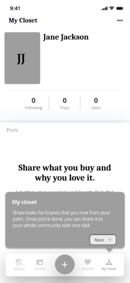
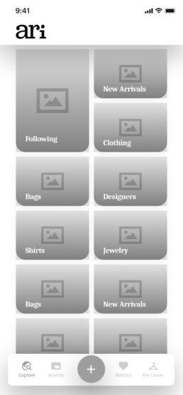
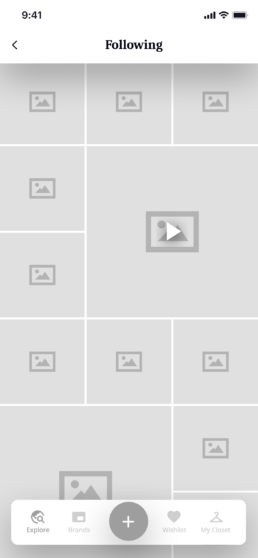
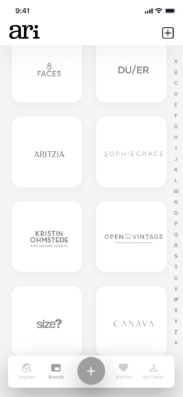
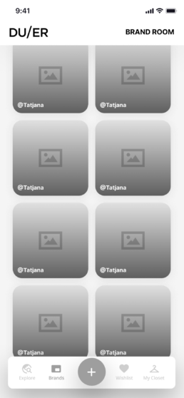
The user flow map informed the creation of key screens for the low-fidelity wireframes, which were used as the basis for the prototypes in the first round of usability testing. As outlined in the user flow map, the prototype included the crucial screens necessary for users to sign up, set up their profiles, explore available brands, shop desired brands and share closet links
IDEATE
Usability Testing
We carried out both in-person and remote usability testing with participants from the target audience. During the testing, we wanted to know the following:
- Did users find it easy to create an account, set up their profiles, and shop a brand?
- Where did users face difficulties in shopping a brand?
- What improvements did users suggest for better interaction design and navigation, making the Closet sharing and Shopping experience more enjoyable?
PROTOTYPE
High Fidelity Prototype
The high-fidelity screens were created following several rounds of usability testing and refinement. Further testing was conducted using a clickable prototype. After several rounds of testing and refinement, here are some UI/UX changes that had a positive impact on users during the testing.
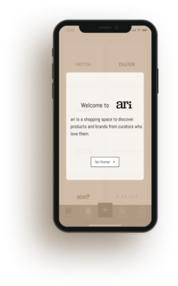
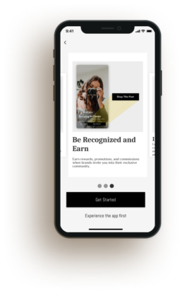
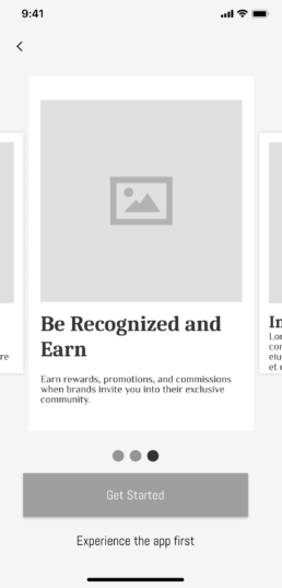
ONBOARDING SCREEN
The onboarding screens were introduced as the initial screens a user sees when using an app for the first time. It guides the user through core features, sets up the account, and sets user experience expectations.
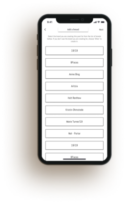
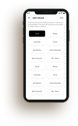
ADDING A BRAND SCREEN
The process of adding a brand was streamlined, making it a more efficient and user-friendly experience. The steps involved were reduced to just three, and features such as improved search and the addition of tags were introduced to make the process even smoother.
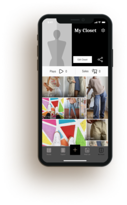
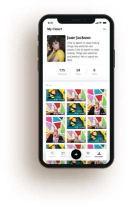
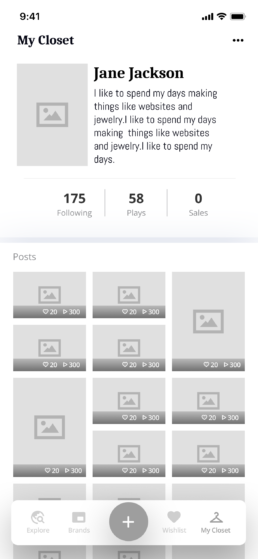
CLOSET SCREEN
The closet screen was redesigned to enhance its appearance and improve the arrangement of closet items. The goal was to create a visually appealing and organized layout to provide an improved user experience.
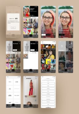
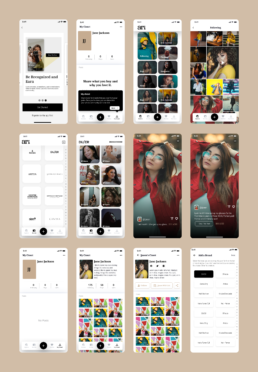
All Screens
Conclusion
This project emphasized the importance of human-centered design and the benefits of collaboration with diverse perspectives. The use of design systems, principles, and centralized tech databases helped ensure a cohesive direction in ari’s development.


